I have just finished reading the book Beautiful Evidence by Edward Tufte and in it he talks about the fundamental principles of analytical design.
Henri Matisse
I do not paint things, I paint only the differences between things
Show Comparisons, Contrasts, Differences
When looking at a graph or reading a statistic a good question and perhaps even the first question you can ask yourself is what I am comparing this too.
Think about the recent about AFL being low scoring. Low scoring compared to what? Another ‘infographic’ from NRL. Is this high is it low? Is he above average/below average all these things are hard to tell.
If I were to just show you a boxplot of AFL scores from this year you might be thinking compared to what?
library(fitzRoy)
library(tidyverse)
## -- Attaching packages -------------------------------- tidyverse 1.2.1 --## v ggplot2 2.2.1 v purrr 0.2.5
## v tibble 1.4.2 v dplyr 0.7.5
## v tidyr 0.8.1 v stringr 1.3.1
## v readr 1.1.1 v forcats 0.3.0## -- Conflicts ----------------------------------- tidyverse_conflicts() --
## x dplyr::filter() masks stats::filter()
## x dplyr::lag() masks stats::lag()library(ggpmisc)## For news about 'ggpmisc', please, see http://www.r4photobiology.info/## For on-line documentation see http://docs.r4photobiology.info/ggpmisc/fitzRoy::get_match_results()%>%
mutate(total=Home.Points + Away.Points)%>%
filter(Season == 2018)%>%
ggplot(aes(y=total, x=as.factor(Season)))+geom_boxplot()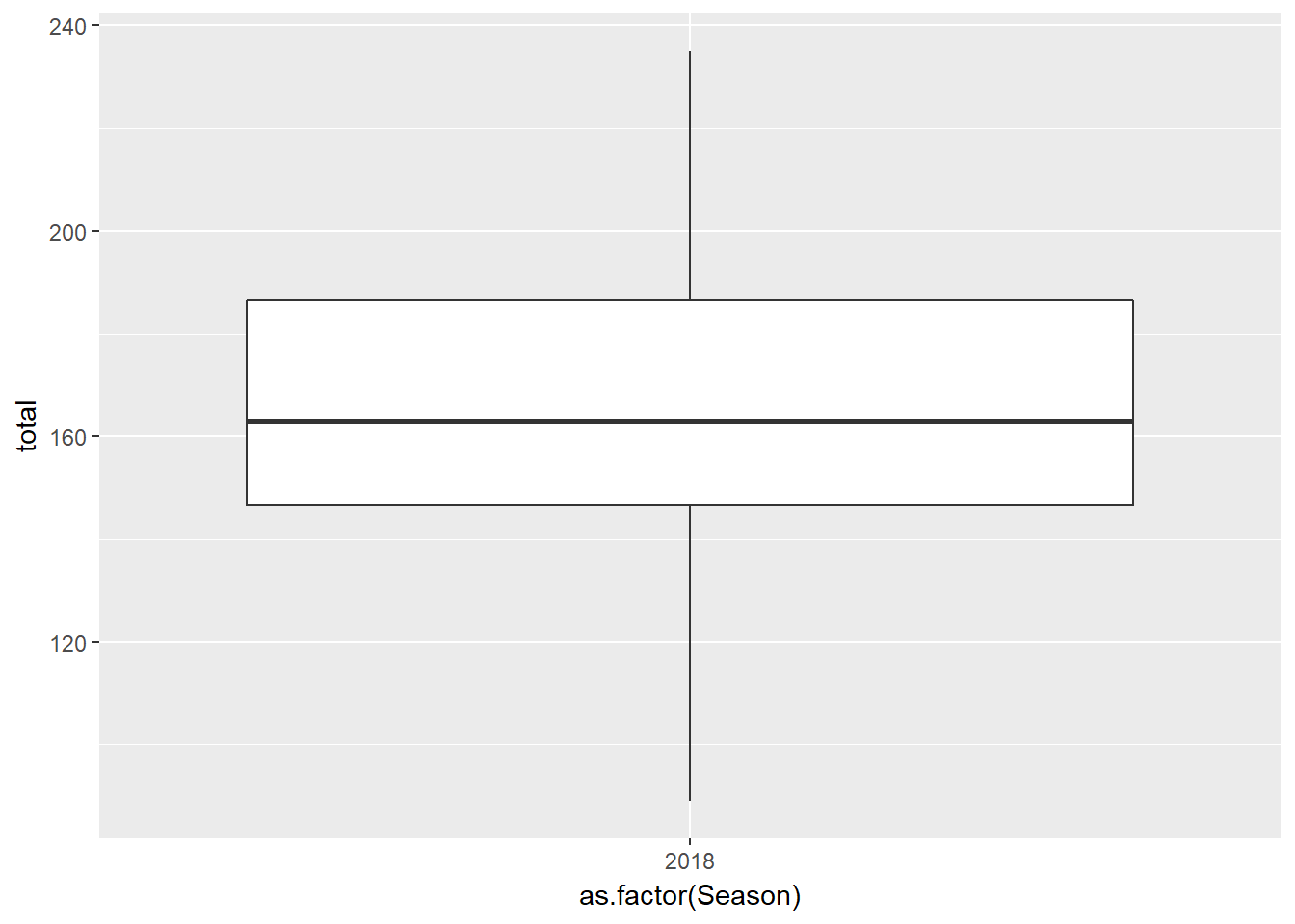
That doesn’t really tell us much does it? You might say I don’t even know if that is low.
But if I plot the past few seasons, it suddenly becomes a lot more informative don’t believe me, look below.
fitzRoy::get_match_results()%>%
  mutate(total=Home.Points + Away.Points)%>%
  filter(Season %in% c(2015,2016,2017,2018))%>%
  ggplot(aes(y=total, x=as.factor(Season)))+geom_boxplot()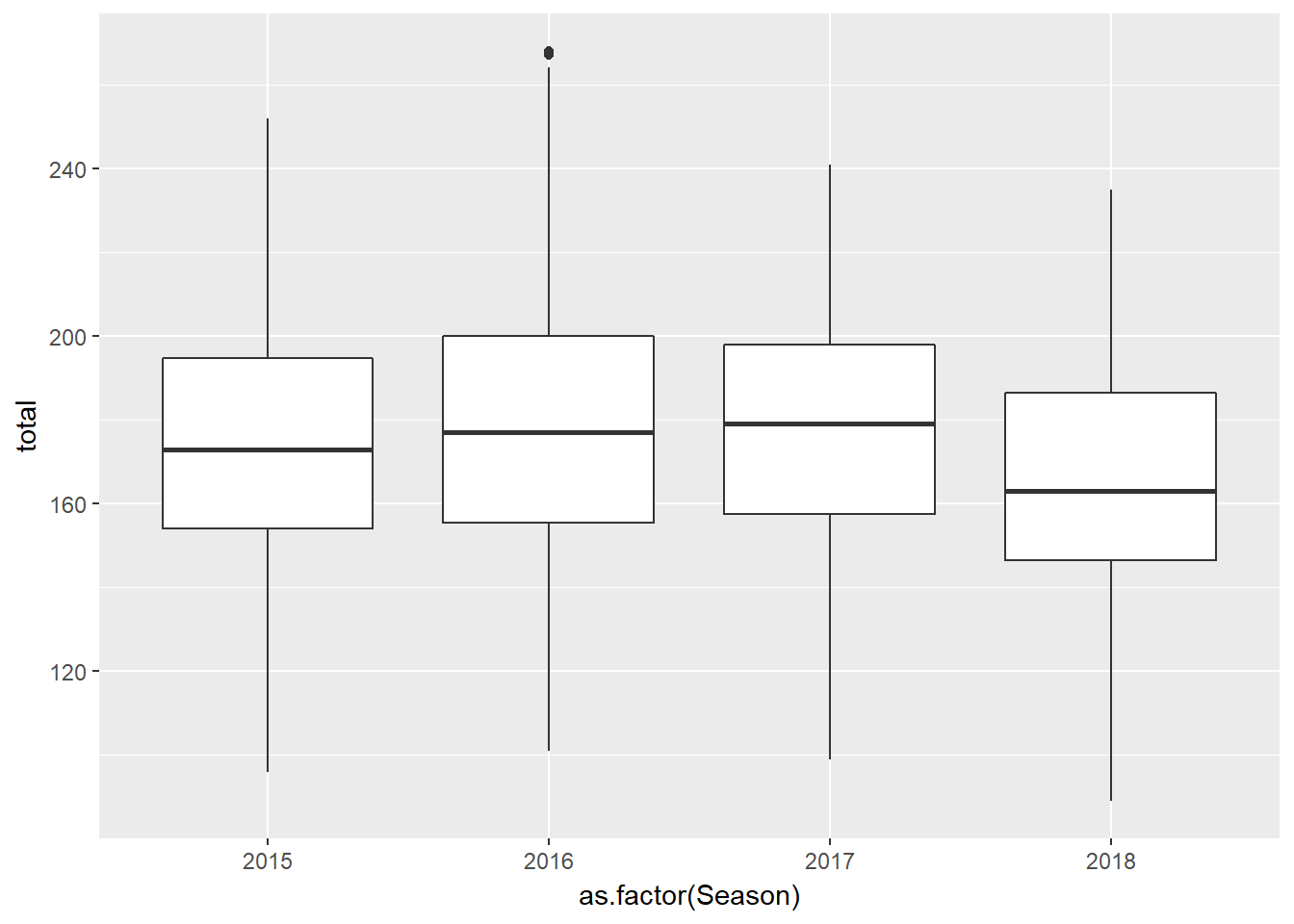
Causality, Mechanism, Structure, Explanation
One possible explanation for this drop in scoring rate is due to increased pressure. Players are fitter than ever and the game isn’t supposed to open up as much as before. As a possible hypothesis we might think there is a negative relationship between the total points scored in games and tackles inside 50.
fitzRoy::player_stats%>%
  group_by(Season, Round, Team)%>%
  filter(Season >2014)%>%
  mutate(tacklesin50total=sum(T5))%>%
  ggplot(aes(y=tacklesin50total, x=as.factor(Season)))+geom_boxplot()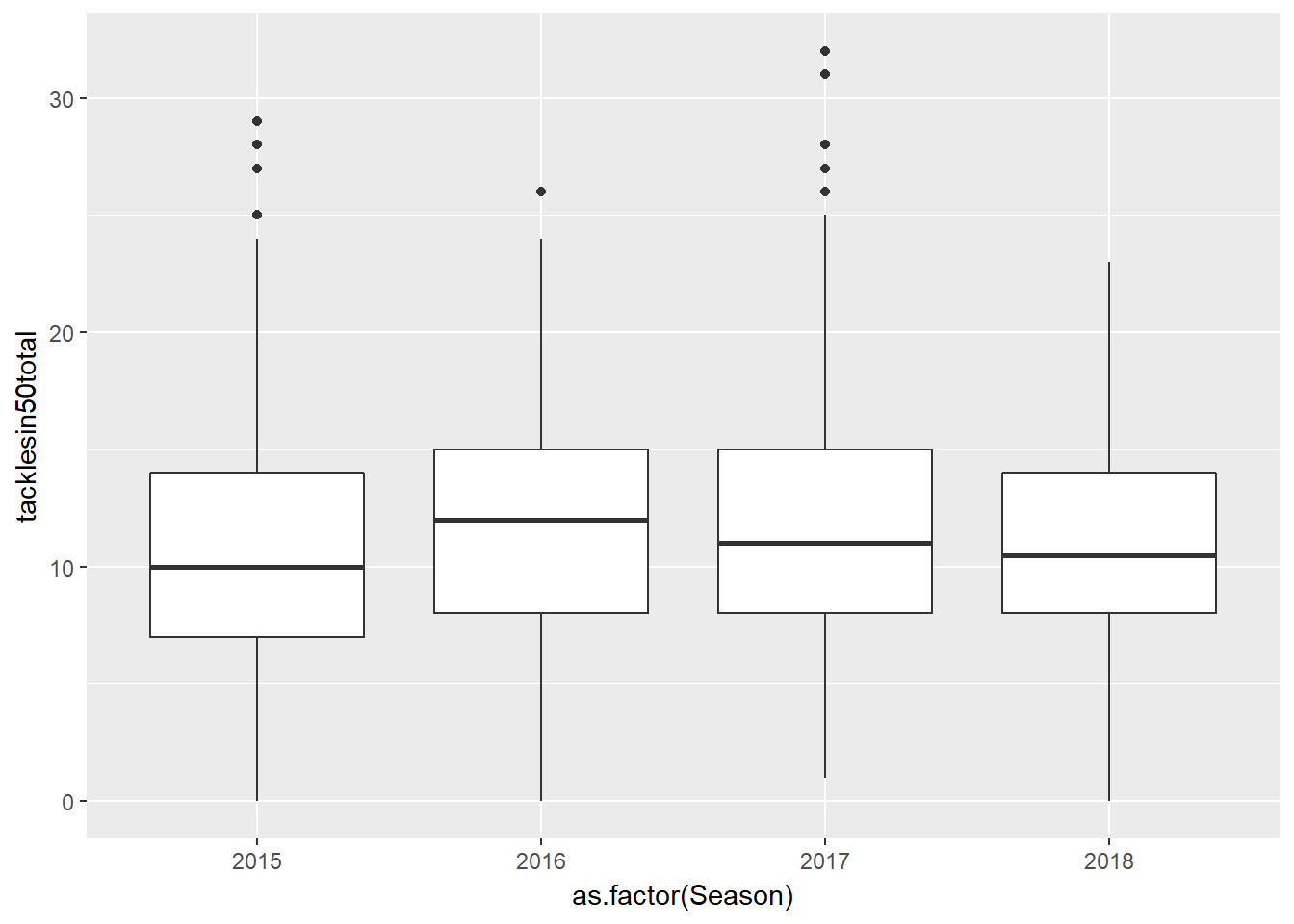
Multivariate Analysis
The analysis of cause and effect, intially bivariate, quickly becomes multivariate through such necessary elaborations as the conditions under which the causal relation holds
If there is a relationship between totals and tackles inside 50 we can look at this visually by looking at a scatterplot
We are going to cheat a bit here and instead of joining the match scores with fitzRoy::get_match_results() we are just going to sum up the player goals, behinds with the tackles.
fitzRoy::player_stats%>%
  group_by(Match_id, Season)%>%
  filter(Season>2014)%>%
  summarise(total=6*sum(G)+ sum(B),
            totaltacklesin50=sum(T5))%>%
  ggplot(aes(x=totaltacklesin50, y=total))+geom_point()+ geom_smooth(method='lm')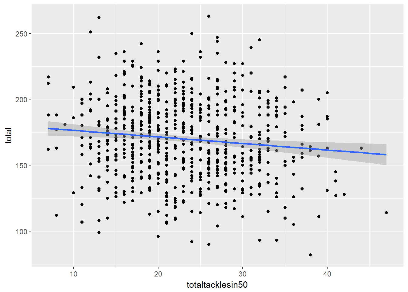
This would be a bivariate example just looking to see if there is anything that looks like a relationship between tackles and totals. It actually look likes there is a slightly weak negative relationship between tackes inside 50 and totals
We can make compare 3 variables at once by faceting
fitzRoy::player_stats%>%
  group_by(Match_id, Season)%>%
  filter(Season>2014)%>%
  summarise(total=6*sum(G)+ sum(B),
  totaltacklesin50=sum(T5))%>%
  ggplot(aes(x=totaltacklesin50, y=total))+
  geom_point() +
  geom_smooth(method='lm') +
facet_wrap(~Season) 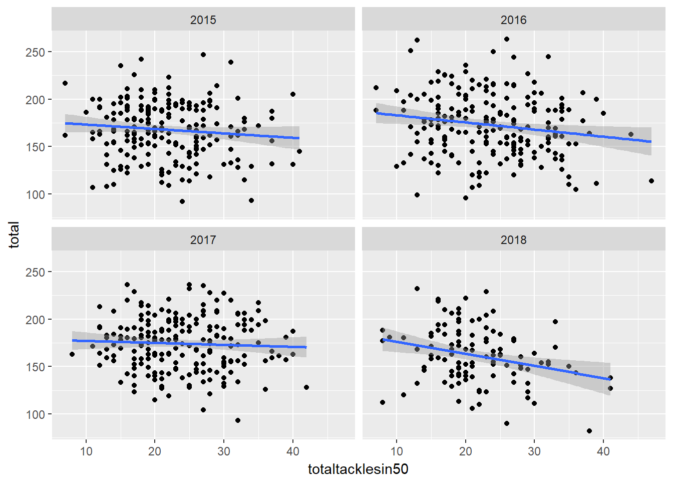
Integration of evidence
Theres no reason to only show a plot or only show a table, you should be able to combine different modes of presentation to make your graphic as information rich as possible.
So here, our plot becomes a bit more informative simply by adding a regression line to our plot. Here we can see what the slope is and with it we can make inference as to our relationship between tackes inside 50 and total points.
Think about it this way if I just presented you with the plot, your first question might be ok, it looks like theres a negative relationship, how does increasing tackle count effect points totals?
By adding a regression line, we can help answer this question and our plot becomes more informative.
library(tidyverse)
formula <- y ~ x
df<-fitzRoy::player_stats%>%
  group_by(Match_id, Season)%>%
  filter(Season>2014)%>%
  summarise(total=6*sum(G)+ sum(B),
            totaltacklesin50=sum(T5))

  ggplot(df,aes(x=totaltacklesin50, y=total))+
    geom_point() +
    geom_smooth(method='lm',formula = formula) +
  stat_poly_eq(aes(label = ..eq.label..),
               formula = formula, parse = TRUE)
Documentation
Its important to keep the code that makes the plot, this helps add credibility to your work. It also means that errors are easy to spot and fix.
Content that means something
When your making plots, figures what is the story you are trying to tell, what is the data you have your disposal. Then what is the best way to present it. If you don’t have great content then whats the point if its not interesting?