I got an email from Alex Zanidean, who runs the xmrr package
“You might enjoy my package xmrr for similar charts – but mine recalculate the bounds automatically” and if we go to the vingette, “XMRs combine X-Bar control charts and Moving Range control charts. These functions also will recalculate the reference lines when significant change has occurred” This seems like a pretty handy thing. So lets do it.
First lets do our graphic from our previous post using ggQC
library(fitzRoy)
library(tidyverse)
## ── Attaching packages ───── tidyverse 1.2.1 ──## ✔ ggplot2 3.1.1 ✔ purrr 0.3.2
## ✔ tibble 2.1.1 ✔ dplyr 0.8.0.1
## ✔ tidyr 0.8.3 ✔ stringr 1.4.0
## ✔ readr 1.3.1 ✔ forcats 0.4.0## ── Conflicts ──────── tidyverse_conflicts() ──
## ✖ dplyr::filter() masks stats::filter()
## ✖ dplyr::lag() masks stats::lag()library(ggQC)
library(xmrr)
fitzRoy::match_results%>%
mutate(total=Home.Points+Away.Points)%>%
group_by(Season,Round)%>%
summarise(meantotal=mean(total))%>%
filter(Season>1989 & Round=="R1")%>%
ggplot(aes(x=Season,y=meantotal))+geom_point()+
geom_line()+stat_QC(method="XmR")+
ylab("Mean Round 1 Total for Each Game") +ggtitle("Stop Freaking OUT over ONE ROUND")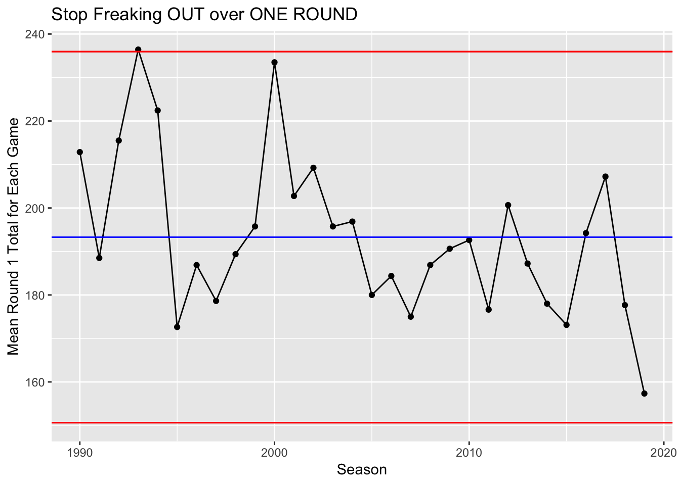
df<-fitzRoy::match_results%>%
  mutate(total=Home.Points+Away.Points)%>%
  group_by(Season,Round)%>%
  summarise(meantotal=mean(total))%>%
filter(Season>1989 &  Round=="R1")
So when using a package for the first time, one of the best things about the R community is how the examples are usually fully reproducible and this helps.
From the github
Year <- seq(2001, 2009, 1)
Measure <-  runif(length(Year))

df <- data.frame(Year, Measure)
head(df)
## Year Measure
## 1 2001 0.5032418
## 2 2002 0.7435385
## 3 2003 0.1127812
## 4 2004 0.3818857
## 5 2005 0.6752043
## 6 2006 0.4476480xmr(df, "Measure", recalc = T)## Year Measure Order Central Line Moving Range Average Moving Range
## 1 2001 0.5032418 1 0.483 NA NA
## 2 2002 0.7435385 2 0.483 0.240 0.358
## 3 2003 0.1127812 3 0.483 0.631 0.358
## 4 2004 0.3818857 4 0.483 0.269 0.358
## 5 2005 0.6752043 5 0.483 0.293 0.358
## 6 2006 0.4476480 6 0.483 0.228 0.358
## 7 2007 0.3416156 7 0.483 0.106 0.358
## 8 2008 0.3271194 8 0.483 0.014 0.358
## 9 2009 0.5749751 9 0.483 0.248 0.358
## Lower Natural Process Limit Upper Natural Process Limit
## 1 NA NA
## 2 0 1.437
## 3 0 1.437
## 4 0 1.437
## 5 0 1.437
## 6 0 1.437
## 7 0 1.437
## 8 0 1.437
## 9 0 1.437Lets create a similar dataframe as df, but using data from fitzRoy
df<-fitzRoy::match_results%>%
  mutate(total=Home.Points+Away.Points)%>%
  group_by(Season,Round)%>%
  summarise(meantotal=mean(total))%>%
filter(Season>1989 &  Round=="R1")%>%
  select(Season, meantotal)
df<-data.frame(df)
xmr_data <-xmr(df, "meantotal", recalc = T)

xmr_chart(df = xmr_data,
          time = "Season",
          measure = "meantotal",
          line_width = 0.75, text_size = 12, point_size = 2.5) +
          scale_x_discrete(breaks = seq(1990, 2020, 5))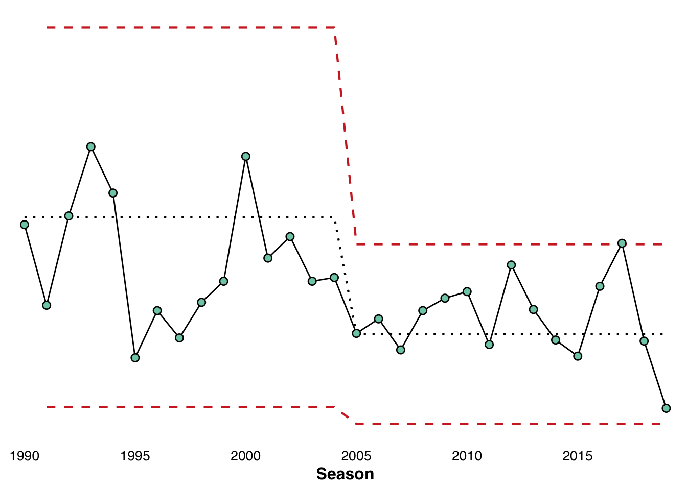
Does this tell a different story or a very similar one to earlier?