“The greatest value of a picture is when it forces us to notice what we never expected to see.” - J. W. Tukey (1977)
To learn a new skill I think there needs to be 2 main drivers
- An interest in a topic
- easy to get to tangible wins to encourage deeper understanding
Hopefully you have stumbled across this blog because you have an interest in footy and because you want to start analysing the game yourself. So lets gets started.
The graph you are going to be able to create by the end of this post, is a cummulative line chart showing how quickly a player racks up a certain stat. For an example of a final product you can have a look at a graph produced by Matt Cowgill.
To get started using R you can download R from here and a nice Rstudio from here.
Once you have those both installed, lets get cracking.
install.packages("tidyverse")
install.packages("devtools")
devtools::install_github("jimmyday12/fitzRoy")
library(fitzRoy)
library(tidyverse)
## Warning: package 'fitzRoy' was built under R version 3.5.1## Warning: package 'tidyverse' was built under R version 3.5.1## -- Attaching packages ---------------------------------- tidyverse 1.2.1 --## v ggplot2 3.1.0 v purrr 0.2.5
## v tibble 1.4.2 v dplyr 0.7.7
## v tidyr 0.8.1 v stringr 1.3.1
## v readr 1.1.1 v forcats 0.3.0## Warning: package 'ggplot2' was built under R version 3.5.1## Warning: package 'tidyr' was built under R version 3.5.1## Warning: package 'purrr' was built under R version 3.5.1## Warning: package 'dplyr' was built under R version 3.5.1## Warning: package 'stringr' was built under R version 3.5.1## -- Conflicts ------------------------------------- tidyverse_conflicts() --
## x dplyr::filter() masks stats::filter()
## x dplyr::lag() masks stats::lag()df<-fitzRoy::get_afltables_stats(start_date = "1897-01-01", end_date = Sys.Date())## Returning data from 1897-01-01 to 2018-11-24## Downloading data##
## Finished downloading data. Processing XMLs## Warning in rbind(names(probs), probs_f): number of columns of result is not
## a multiple of vector length (arg 1)## Warning: 396 parsing failures.
## row # A tibble: 5 x 5 col row col expected actual file expected <int> <chr> <chr> <chr> <chr> actual 1 8713 Round an integer QF 'https://afltables.com/afl/stats/2018_sta~ file 2 8714 Round an integer QF 'https://afltables.com/afl/stats/2018_sta~ row 3 8715 Round an integer QF 'https://afltables.com/afl/stats/2018_sta~ col 4 8716 Round an integer QF 'https://afltables.com/afl/stats/2018_sta~ expected 5 8717 Round an integer QF 'https://afltables.com/afl/stats/2018_sta~
## ... ................. ... .......................................................................... ........ .......................................................................... ...... .......................................................................... .... .......................................................................... ... .......................................................................... ... .......................................................................... ........ ..........................................................................
## See problems(...) for more details.## Warning: Unknown columns: `Substitute`## Finished getting afltables datadf%>%filter(Season>1990)%>%
group_by(ID) %>%
mutate(games_played=row_number())%>%
mutate(cummulativefrees=cumsum(Frees.For))%>%
ggplot(aes(x=games_played, y=cummulativefrees, group = ID)) + geom_line() +xlab("Games Played") +ylab("Cummulative Count of Free kicks received") 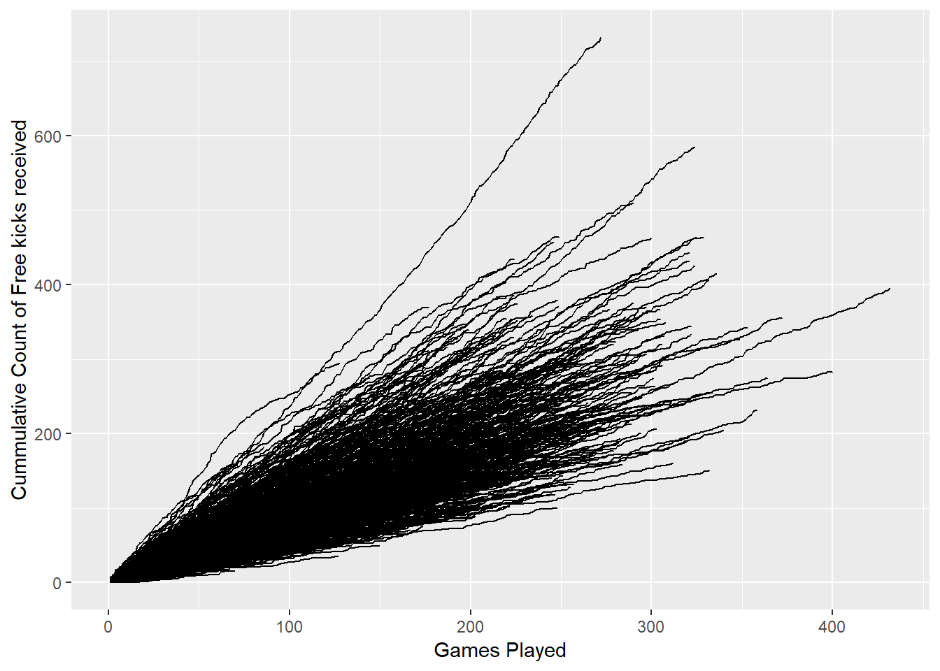
Hopefully you are able to run the script above and get the same graph. If not #makemeauseR and tweet at me and I will lend a hand. Alternively there are great open slack groups like the R4DS where members are some of the most helpful going around!
So now you have hopefully the quick win out the way and you are now a bit more keen on diving in and seeing how this all works.
Why use ggplot2
- The writing of the code helps you think about how your data drives the visualisation journey
- easy to use and make changes if you want to see different variables, timeframes etc
Before you plot checklist
- data is tidy
- each variable is a column
- each observation is a row
Another example a little explanation
Get the data – fitzRoy hopefully makes this an easier job because the data is already stored in a tidy format
But its not just enough to have data, after all whats the point? You want to do some analyse and visualise data because you have a question in mind, you are driven to look into something that you find interesting.
So with that in mind, lets see if there is a relationship between Contested.Marks and Weight.
# install.packages("devtools")
devtools::install_github("jimmyday12/fitzRoy")
library(fitzRoy)
library(tidyverse)
df<-fitzRoy::get_afltables_stats(start_date = "1897-01-01", end_date = Sys.Date())
Now that you have your dataframe df you can see that it collection of variables (columns) and observations of those variables (rows) df looking at some of these variables in df
MarksContested.Marks
Bit more ploting explanation
df%>%
ggplot(aes(x=Marks, y=Contested.Marks)) +
  geom_point() + facet_wrap(~Playing.for)
## Warning: Removed 401 rows containing missing values (geom_point).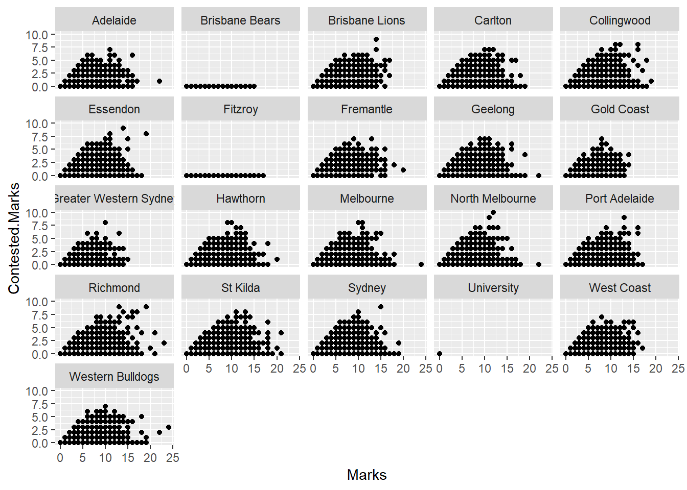
Let me explain some of the commands going on here.
df is what we called our dataframe before, this is followed by the ‘pipe’ operator %>%. In simple terms it takes the output of one df and inserts it into the next ggplot In short this “chaining” allows you to pass a result onto the next function. For the above example we first create a dataframe called df (how creative) the next line we take this data and this dataframe df becomes the data we will base our plot off.
aes
aes– Aesthetic mappings describe how variables in the data are mapped to visual properties (aesthetics) of geoms. Aesthetics are things such as xy and colours x=Marks, y=Contested.Marks colour=Playing.For
geom
Geoms are the geometric objects displayed in the plot. Here geom_ controls the type of plot you want. For example geom_point will give you a scatterplot, geom_line a line graph
facet
Facet is a more general case of common conditioned or trellis plots. Faceting creates small multiples of different subsets of a dataset. These plots come in handy when you want to compare if patterns are the same or different across conditions facets
Putting it all together
- Question - I want to visualise the MAE of the squiggle tipsters.
Thankfully, fitzRoy has easy to use functions to get the squiggle data!
library(fitzRoy)
tips <- get_squiggle_data("tips")
## Getting data from https://api.squiggle.com.au/?q=tipshead(tips) ## hteam venue ateam err
## 1 Carlton M.C.G. Richmond 42.00
## 2 Carlton M.C.G. Richmond NA
## 3 Carlton M.C.G. Richmond 48.39
## 4 Collingwood M.C.G. Western Bulldogs 3.69
## 5 Collingwood M.C.G. Western Bulldogs 3.00
## 6 Adelaide Adelaide Oval Greater Western Sydney 53.00
## date hconfidence hteamid updated correct
## 1 2017-03-23 19:20:00 50.0 3 2017-07-11 13:59:46 1
## 2 2017-03-23 19:20:00 42.0 3 2017-04-10 12:18:02 1
## 3 2017-03-23 19:20:00 56.7 3 2017-07-11 13:59:46 0
## 4 2017-03-24 19:50:00 37.3 4 2017-07-11 13:59:46 1
## 5 2017-03-24 19:50:00 38.0 4 2017-07-11 13:59:46 1
## 6 2017-03-26 15:20:00 50.0 1 2017-07-11 13:59:46 1
## source round bits tip gameid year tipteamid
## 1 Squiggle 1 0.0000 Richmond 1 2017 14
## 2 Figuring Footy 1 0.2141 Richmond 1 2017 14
## 3 Matter of Stats 1 -0.2076 Carlton 1 2017 3
## 4 Matter of Stats 1 0.3265 Western Bulldogs 2 2017 18
## 5 Squiggle 1 0.3103 Western Bulldogs 2 2017 18
## 6 Squiggle 1 0.0000 Adelaide 8 2017 1
## margin confidence ateamid sourceid
## 1 1.00 50.0 14 1
## 2 NA 58.0 14 3
## 3 5.39 56.7 14 4
## 4 10.31 62.7 18 4
## 5 17.00 62.0 18 1
## 6 3.00 50.0 9 1Getting data in the right format
What do I actually want to visualise here?
I would like to see the data for this year 2018 filter(year>2017) that shows me for a given round and tipster group_by(round, source) of the squiggle tipsters by round and tipster their average MAE for that round by said tipster summarise(MAE_by_round=mean(err))
 tips%>%
  filter(year>2017)%>%
   group_by(round, source)%>%
   summarise(MAE_by_round=mean(err))
## # A tibble: 351 x 3
## # Groups: round [?]
## round source MAE_by_round
## <int> <chr> <dbl>
## 1 1 Aggregate 21.1
## 2 1 Footy Maths Institute 26
## 3 1 Graft 20.1
## 4 1 HPN 31.7
## 5 1 Live Ladders 20.8
## 6 1 Massey Ratings 21.1
## 7 1 Matter of Stats 24.4
## 8 1 PlusSixOne 19.7
## 9 1 Punters NA
## 10 1 Squiggle 22
## # ... with 341 more rowsNow that we have our data in the right format for plotting lets you know get plotting!
tips%>%
  filter(year>2017)%>%
   group_by(round, source)%>%
   summarise(MAE_by_round=mean(err))%>%
  ggplot(aes(x=round, y=MAE_by_round))+
  geom_point()
## Warning: Removed 27 rows containing missing values (geom_point).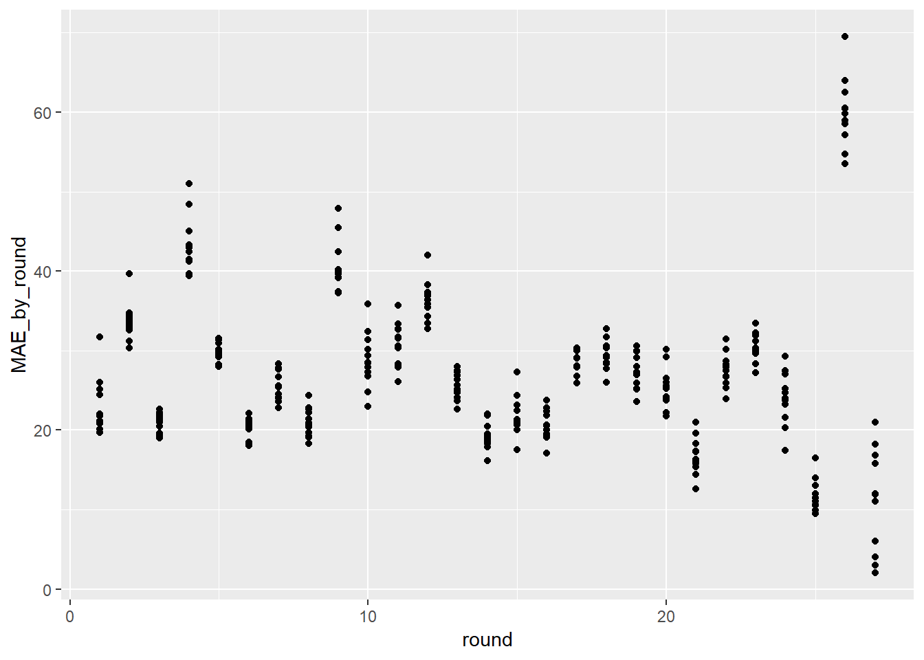
So what can we see here? We can see the average MAE by tipster by round for 2018. The problem is we can’t identify which tipster is who. So how can we do that? Just add colour.
tips%>%
  filter(year>2017)%>%
   group_by(round, source)%>%
   summarise(MAE_by_round=mean(err))%>%
  ggplot(aes(x=round, y=MAE_by_round))+
  geom_point(aes(colour=source))
## Warning: Removed 27 rows containing missing values (geom_point).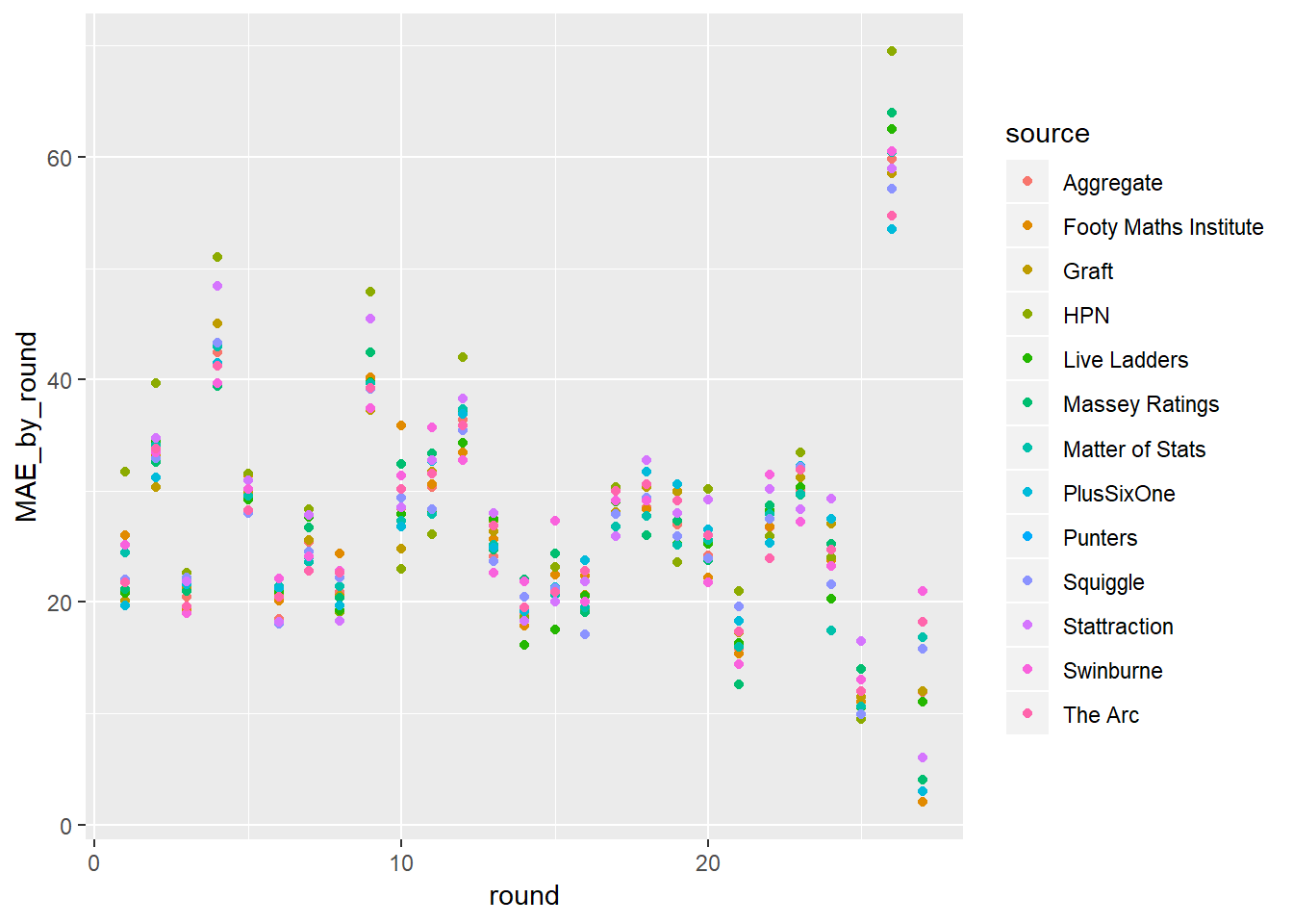
Ok now that we have added some colour things are still hard to see, so what if we joined each point for the respective tipster?
tips%>%
  filter(year>2017)%>%
   group_by(round, source)%>%
   summarise(MAE_by_round=mean(err))%>%
  ggplot(aes(x=round, y=MAE_by_round))+
  geom_point(aes(colour=source)) +
  geom_line(aes(group=source, colour=source))
## Warning: Removed 27 rows containing missing values (geom_point).## Warning: Removed 27 rows containing missing values (geom_path).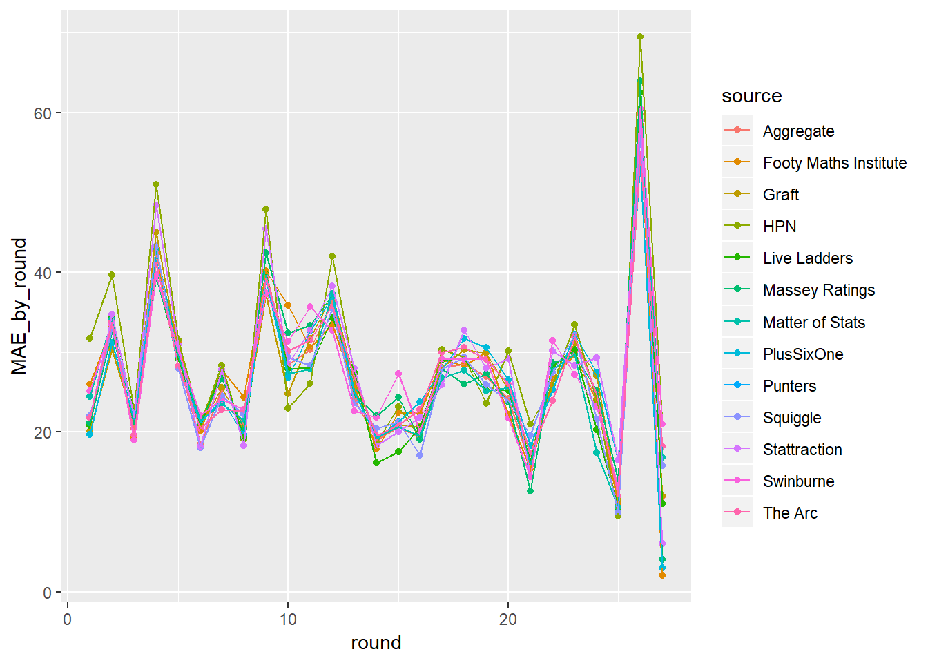
Ok so now things are a bit clearer but still not as clear as we would like. Its hard to get a feel for each individual tipster because all the points are fairly close which makes our lines close together so disentanglement becomes difficult. This is where faceting or small multiples comes in handy.
tips%>%
  filter(year>2017)%>%
   group_by(round, source)%>%
   summarise(MAE_by_round=mean(err))%>%
  ggplot(aes(x=round, y=MAE_by_round))+
  geom_point(aes(colour=source)) +
  geom_line(aes(group=source, colour=source)) +facet_wrap(~source)
## Warning: Removed 27 rows containing missing values (geom_point).## Warning: Removed 27 rows containing missing values (geom_path).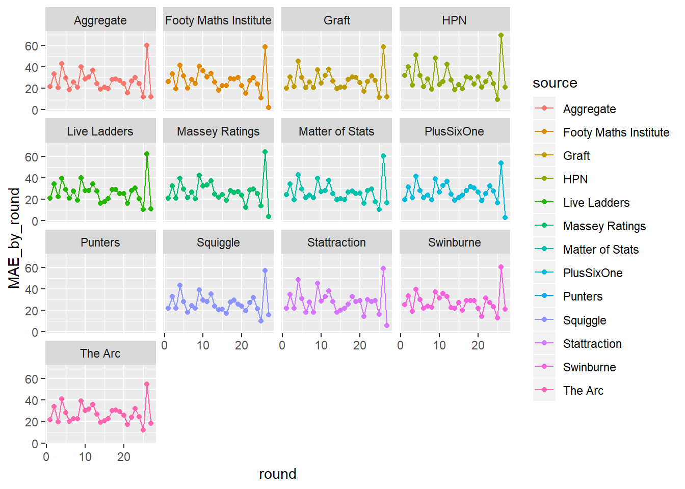
There you go how cool is that!