Something I thought would be interesting is trying to visualise how the different tipsters on squiggle rate match-ups.
A simple way to do this would be to look at squiggle margins by tipster and visualise it on a plot.
To hopefully encourage you to give it a go at home why not change “West Coast” to the team you support to see if different squiggle tipsters rate your team differently.
library(fitzRoy)
library(lubridate)
##
## Attaching package: 'lubridate'## The following object is masked from 'package:base':
##
## datelibrary(tidyverse)## -- Attaching packages -------------------------------- tidyverse 1.2.1 --## v ggplot2 2.2.1 v purrr 0.2.5
## v tibble 1.4.2 v dplyr 0.7.5
## v tidyr 0.8.1 v stringr 1.3.0
## v readr 1.1.1 v forcats 0.3.0## -- Conflicts ----------------------------------- tidyverse_conflicts() --
## x lubridate::as.difftime() masks base::as.difftime()
## x lubridate::date() masks base::date()
## x dplyr::filter() masks stats::filter()
## x lubridate::intersect() masks base::intersect()
## x dplyr::lag() masks stats::lag()
## x lubridate::setdiff() masks base::setdiff()
## x lubridate::union() masks base::union()library(ggthemes)
tips <- get_squiggle_data("tips")## Getting data from https://api.squiggle.com.au/?q=tipsdf<-tips%>%mutate(home.margin=ifelse(hteam==tip, margin,-margin))%>%
mutate(away.margin=ifelse(ateam==tip, margin,-margin)) %>%
select(source,date,correct, hconfidence,hteam,
ateam,home.margin,away.margin,err ,tip,round, year)
df1<-select(df,source, date, correct, hconfidence,hteam, home.margin, err, tip, round, year )
df1$H_A<-"HOME"
df2<-select(df, source, date, correct, hconfidence, ateam, away.margin, err, tip, round, year)
df2$H_A<-"AWAY"
colnames(df1)[5]<-"TEAM"
colnames(df1)[6] <- "margin"
colnames(df2)[5]<-"TEAM"
colnames(df2)[6]<-"margin"
df3<-rbind(df1,df2)
str(df3$date)## chr [1:7738] "2017-03-23 19:20:00" "2017-03-23 19:20:00" ...df3$date<-ymd_hms(df3$date)
df3%>%arrange(date)%>%
filter(date>"2018-01-09")%>%
filter(round<10)%>%
filter(TEAM=="West Coast")%>%
ggplot(aes(y=margin, x=date,fill=H_A))+geom_col() +
ggtitle("West Coast") +
theme_economist_white() +
theme(plot.title = element_text(size =12),
axis.text = element_text(size = 6),
strip.text = element_text(size = 12))+
facet_wrap(~source)## Warning: Removed 9 rows containing missing values (position_stack).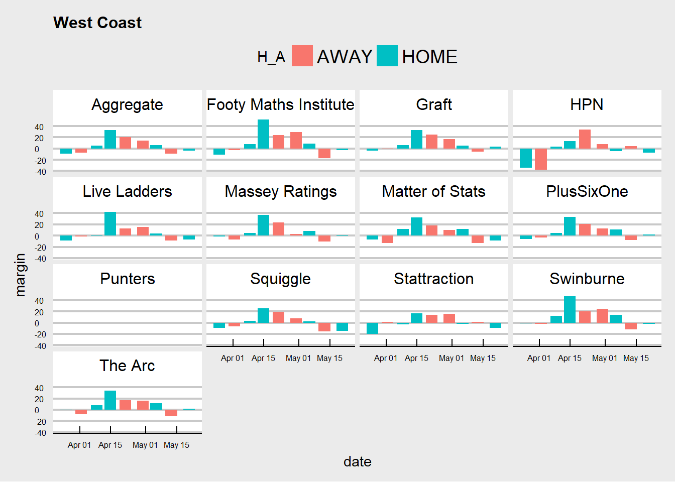
So lets dive a bit deeper into what is going on here.
Before we graph nice pretty things. Lets think about what kind of information we want to look at, how this information can help us answer the kind of question we are asking ourselves.
Lets work backwards, because lets be honest I am pretty behind.
- Question asking self - How can I visualise how different tipsters rate different teams
One way to do this is to think about their individual predictions as their ratings for teams. For example say if eagles are playing the swans and if I say the eagles will win by 12, but you say the eagles will win by 40 we differ. You might rate the eagles higher than I do or rate swans much lower and it could very well be a combination of both those thoughts.
So what this means is that I can visualise the margin prediction as a rough proxy for teams.
So now that I am happy as margin as a rough proxy, I want to see how that changes game by game for a given team and by tipster.
- Small Multiples
facet_wrap
When you think about the same graph (round by margin) and I want to compare different slices of the data (round by margin for tipster j) we can think about using small multiples.
Step One
library(fitzRoy)
library(lubridate)
library(tidyverse)
library(ggthemes)First we have to load the necessary packages, if this is your first time just replace library with install.packages("insert package here")
Step Two - Get the data
tips <- get_squiggle_data("tips")Step Three - View the data
head(tips)## gameid ateam confidence round hconfidence sourceid year
## 1 1 Richmond 50.0 1 50.0 1 2017
## 2 1 Richmond 58.0 1 42.0 3 2017
## 3 1 Richmond 56.7 1 56.7 4 2017
## 4 2 Western Bulldogs 62.7 1 37.3 4 2017
## 5 2 Western Bulldogs 62.0 1 38.0 1 2017
## 6 8 Greater Western Sydney 50.0 1 50.0 1 2017
## bits date correct ateamid margin venue hteamid
## 1 0.0000 2017-03-23 19:20:00 1 14 1.00 M.C.G. 3
## 2 0.2141 2017-03-23 19:20:00 1 14 NA M.C.G. 3
## 3 -0.2076 2017-03-23 19:20:00 0 14 5.39 M.C.G. 3
## 4 0.3265 2017-03-24 19:50:00 1 18 10.31 M.C.G. 4
## 5 0.3103 2017-03-24 19:50:00 1 18 17.00 M.C.G. 4
## 6 0.0000 2017-03-26 15:20:00 1 9 3.00 Adelaide Oval 1
## updated tipteamid tip hteam
## 1 2017-07-11 13:59:46 14 Richmond Carlton
## 2 2017-04-10 12:18:02 14 Richmond Carlton
## 3 2017-07-11 13:59:46 3 Carlton Carlton
## 4 2017-07-11 13:59:46 18 Western Bulldogs Collingwood
## 5 2017-07-11 13:59:46 18 Western Bulldogs Collingwood
## 6 2017-07-11 13:59:46 1 Adelaide Adelaide
## source err
## 1 Squiggle 42.00
## 2 Figuring Footy NA
## 3 Matter of Stats 48.39
## 4 Matter of Stats 3.69
## 5 Squiggle 3.00
## 6 Squiggle 53.00names(tips)## [1] "gameid" "ateam" "confidence" "round" "hconfidence"
## [6] "sourceid" "year" "bits" "date" "correct"
## [11] "ateamid" "margin" "venue" "hteamid" "updated"
## [16] "tipteamid" "tip" "hteam" "source" "err"glimpse(tips)## Observations: 3,869
## Variables: 20
## $ gameid <int> 1, 1, 1, 2, 2, 8, 1, 2, 4, 3, 5, 6, 7, 8, 9, 10, 1...
## $ ateam <chr> "Richmond", "Richmond", "Richmond", "Western Bulld...
## $ confidence <dbl> 50.0, 58.0, 56.7, 62.7, 62.0, 50.0, 58.8, 64.1, 52...
## $ round <int> 1, 1, 1, 1, 1, 1, 1, 1, 1, 1, 1, 1, 1, 1, 1, 2, 2,...
## $ hconfidence <dbl> 50.0, 42.0, 56.7, 37.3, 38.0, 50.0, 41.2, 35.9, 52...
## $ sourceid <int> 1, 3, 4, 4, 1, 1, 2, 2, 2, 2, 2, 2, 2, 2, 2, 2, 2,...
## $ year <int> 2017, 2017, 2017, 2017, 2017, 2017, 2017, 2017, 20...
## $ bits <dbl> 0.0000, 0.2141, -0.2076, 0.3265, 0.3103, 0.0000, 0...
## $ date <chr> "2017-03-23 19:20:00", "2017-03-23 19:20:00", "201...
## $ correct <int> 1, 1, 0, 1, 1, 1, 1, 1, 0, 0, 0, 0, 0, 1, 1, 0, 1,...
## $ ateamid <int> 14, 14, 14, 18, 18, 9, 14, 18, 11, 13, 2, 10, 17, ...
## $ margin <dbl> 1.00, NA, 5.39, 10.31, 17.00, 3.00, 8.00, 13.00, 2...
## $ venue <chr> "M.C.G.", "M.C.G.", "M.C.G.", "M.C.G.", "M.C.G.", ...
## $ hteamid <int> 3, 3, 3, 4, 4, 1, 3, 4, 15, 16, 8, 5, 12, 1, 6, 14...
## $ updated <chr> "2017-07-11 13:59:46", "2017-04-10 12:18:02", "201...
## $ tipteamid <int> 14, 14, 3, 18, 18, 1, 14, 18, 15, 16, 8, 10, 12, 1...
## $ tip <chr> "Richmond", "Richmond", "Carlton", "Western Bulldo...
## $ hteam <chr> "Carlton", "Carlton", "Carlton", "Collingwood", "C...
## $ source <chr> "Squiggle", "Figuring Footy", "Matter of Stats", "...
## $ err <dbl> 42.00, NA, 48.39, 3.69, 3.00, 53.00, 35.00, 1.00, ...From this we can start to get a feel for our data. We can see that our source variable is the tipster, next we have what team they tipped and so on.
glimpse is very important, what this allows you to see is the kind of variables you have and hopefully you can then get ahead of some possible issues down the line. For example, we can see that our date variable is a character which we would much rather be saved as a date variable. We will change this later on using ymd_hms from lubridate
Step Four - Create the variables we need
tips%>%mutate(home.margin=ifelse(hteam==tip, margin,-margin))%>%
mutate(away.margin=ifelse(ateam==tip, margin,-margin)) %>%
select(source,date,correct, hconfidence,hteam,
ateam,home.margin,away.margin,err ,tip,round, year)Looking at the data earlier, you hopefully noticed that there was only a margin for the team that was tipped! Thats ok we just need to add the opposite for the team that wasn’t tipped to win. All this is saying is if I tip eagles to win by 12, I am also tipping swans to lose by 12.
For this we use mutate and an ifelse.
Step Five - Get the data ready for plotting
So this is pretty round about but some habits are just hard to break.
df<-tips%>%mutate(home.margin=ifelse(hteam==tip, margin,-margin))%>%
  mutate(away.margin=ifelse(ateam==tip, margin,-margin)) %>%
  select(source,date,correct,  hconfidence,hteam,
         ateam,home.margin,away.margin,err ,tip,round, year)


df1<-select(df,source, date, correct, hconfidence,hteam, home.margin, err, tip, round, year )
df1$H_A<-"HOME"
df2<-select(df, source, date, correct, hconfidence, ateam, away.margin, err, tip, round, year)
df2$H_A<-"AWAY"
colnames(df1)[5]<-"TEAM"

colnames(df1)[6] <- "margin"

colnames(df2)[5]<-"TEAM"

colnames(df2)[6]<-"margin"

df3<-rbind(df1,df2)
str(df3$date)
df3$date<-ymd_hms(df3$date)Step Six - Get graphing!
df3%>%arrange(date)%>%
  filter(date>"2018-01-09")%>%
  filter(round<10)%>%
  filter(TEAM=="West Coast")%>%
  ggplot(aes(y=margin, x=date,fill=H_A))+geom_col() +
  ggtitle("West Coast")   +
  theme_economist_white() +
  theme(plot.title  = element_text(size =12),
        axis.text = element_text(size = 6),
        strip.text = element_text(size = 12))+
  facet_wrap(~source)